Table of Contents
Why do you need to know color contrast and color theory?
Life is blind without colors; we see them everywhere in any object. Starting from clouds in the sky, black stones, blue water, red blocks, and green forests, we feel colors. As every object is associated with a color, the same is the case for every color that is associated with emotions. They express feelings, make moods and depict some sort of emotions.
Skilled designers and packaging experts add such emotions in objects by appending emotional colors in them. This is not by chance that restaurants use red color in brochures printing, and sustainable packaging is represented with green colors. Actually, red color increases hunger and green color is associated with forest.
Whenever we view such colors, a specific emotion triggers in our mind, just like green for the eco nature.
Being an Entrepreneur, your packaging should be like this:
Because you need packaging boxes for products, selecting colors and understanding the psychology of colors are paramount to you.
With a basic understanding of colors, meaning, and science, you can get effective and creative custom boxes for products.
Such designs are always memorable and express the vision and mission of the business.
What is the origin of colors meaning?
Basically, colors come from many places since the long green color is associated with vegetables and plants. However, in the 18th century, the same green color was associated with poison. So, it is obvious that the meaning of a color can change at any time and depends upon some event happening in the world. Next to this, few colors are associated with cultures. Orange is the symbol of happiness in Japan and China. So, colors are also associated with past events and history.
Red is a mourning color in South Africa and resembles bloodshed. This is mourning for such people who sacrificed in the past. Contrary to this, in some cultures, red and black are being used for mourning. Specifically, in India and Asia, white and black colored dresses represent mourning.
From Where color combinations come from?
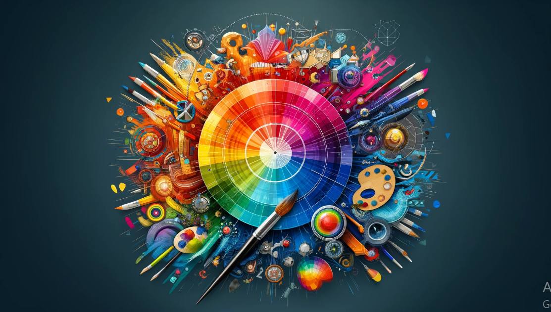
Different color combinations have different meanings, like light blue and white together is like chilly. Furthermore, brown and pink express candies and chocolate. In order to understand more about combination, we need to understand the color theory. Here in this article we will discuss the packaging colors and their combinations.
In addition to the above discussion, here are a few things that play an important role in knowing and understanding the meaning of color.
- Their pairing, typography, fonts and elements combination.
- Saturation of colors, and desaturations
- Mixing quantity and intensity
- Their shades tint and tones (Light Tone and Dark tone colors have different meanings)
Color combinations for the logo design:
Whole branding stand on the logo of the product or company, thus logo colors are set with great color. Such colors tell about the vision and mission of the organization. In this video you will get to know more about logo colors.
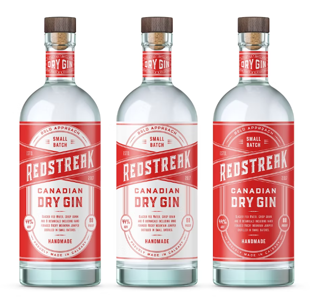
Meaning of Red Color in Packaging Boxes:
In today’s era, we express love, passion and anger with red color. All the love gifts and products use the red color for packaging. This shows intense emotions that are higher than normal ones. In addition to this, this also represents dangerous situations, blood, alarms, stop signs, tension and rise in temperature.
On the other hand, in Asian countries it is considered as luck, and used for power, energy, booster, and nutrition.
What if we use red in custom printed boxes?
To catch the attention of the passersby, we use red color packaging for impactful presentation, highlight the text, and express true feelings.

Youth, Enthusiasm, and creativity are because of the Orange color:
What if we use orange color packaging for products? It is associated with boldness, brightness, and energy, like red. One major difference between red and orange is orange doesn’t depict a dangerous situation. So, it is also used for the safety of equipment.
It represents energy in youth, it is zest color, so brands targeting children love this color. It adds sense of energy, and its autumnal characteristic make it useful for variety of brands.
When should we use orange in custom box designs?
For sophisticated brands this is not a pleasant color, this is a loud color. This is good for the brands that are bold, noisy and energetic brands, and slightly lower in intensity than that of red. Mainly it is using in yoga, jewelery creativity, youth talent, creativity and accessibility themes.

The next color is the color of happiness – Yellow:
Yellow is the color of hope and happiness, and it is a spontaneous color. Usually, it represents the sun, smiles, sunflowers, faces and youth. This color brings attention-grabbing, positivism and hope in life. Additionally, this is a color used in cautions and precautions badges. Furthermore, it is a bright, upbeat and talented color.
Different locations have different meanings for yellow; the Middle East and Latin America use this for mourning; in Africa, this is wealth. In the West, it is a joyful color, and it is also a funeral in Guatemala. So, when we are targeting our custom boxes to a specific regional audience, we need to consider the yellow color’s historical and current associations with this color.
When are we using yellow color in-box packaging?
Be mindful when using yellow and targeting your regional audiences. We use yellow color in box packaging when;
- We need to grab the attention of consumers; then we use neon’s
- When we want to show positivism
Here are examples of the yellow color box packaging.
The next color is green – natural, growth, harmony, wealth and stability:
Everyone is familiar with green colors, plants, forests, nature and eco-nature. As plants are healthy and pleasant to see, so green is similar to them. In some cultures, green is associated with new life, represents youth, and expresses fertility. In the Middle East, green color is wealth and is associated with the Islamic religion.
Brands commonly use green color in product packaging:
- Food brands
- Health Brands
- Food options
- Cool stuff
- Calm and peace
- NGOs working in the environmental sector
What green color shows in a brand image?
This represents the following things;
- Affirmatively
- Traffic lights for permission
- Prosperity
- Stability
- Wealth
When we use green color in boxes packaging?
When we are using green color in cardboard boxes packaging, it is the mixture of all above emotions in one go. It is a common choice, and represent the prosperity. It is the best color that we use anywhere in all sort of boxes.
Intelligence packaging, calm, and trust are associated with the blue color:
Firstly, red and blue are not opposite colors, but red is bold and blue is a calm color. There are blue lakes, rivers, sea and oceans with sky. Blue color has spiritual associations. In India, it represents Krishna. In other places, it represents heaven.
When should the blue color be used in packaging boxes?
If you want to represent the calmness and something cool then blue color packaging should be your first choice. Brands that sell cooling stuff, like AC, water bottles, ice and related things, opt for blue color. Such brands also use blue color in logos, battle wrappers and stickers.
The blue color also shows trust and is mostly used by the following brands;
- Financial institutions
- Communication professionalisms
- Technology sec

We use Purple Color for mystery and spirituality:
Purple and violet colors are similar and it comes when blue and red mixed. Purple color is mysterious, magical, playful, and express deep solemn. Since many centuries it is being used for clergy, and royalty. This color shows more sophisticated when used minimum.
When should violet be used in box packaging?
This is evolving color, and best use in banking, finance, technology and electronic gadgets. Moreover, this is consistently being used in crypto currencies, wealth and luxury products packaging.
The next color is Pink – Easily understandable:
This color is softer than red, even if it is hot pink. It is the color of love, and it feels funky, futuristic, and fun. This is not a serious color and is mainly used to attract youth. It is also used in the following industries’ packaging.
- Candy brands use pink color logos and packaging.
- Bakeries and sweets use this color packaging and logos.
- Romance, flirt, gifts, sweetness, floral designs, floral designs resorts, use pink color designs for packaging and also in the environment.
- In addition to this, it is used in neon lights with soft shades.
When to use Pink Color in product packaging?
When you want to express your products as a symbol of love, sweetness, romance, target youth, baby-focused products, soft touch, delicate items, gifts and sympathy feelings.
Use brown color for wholesomeness, honesty and warmth Products packaging:
This color depict strength, stability, support, farming, agriculture, out door activities, earthy and yield natural look. This is practical friendly color, present old-fashioned, established, and peace. This is the reason that major brands use brown color in logo and product packaging.
When to use brown color in design?
This is a sophisticated color that never bore your audience. This could be use in product packaging for communication, sustainability, and good for outdoor brands. Furthermore, it is also a good color to use in handicraft industry, and organic stuff packaging.

Need Simple and Minimum – Go for white color:
White is like a blank canvas, and we see when a surface reflects all of its colors. This is sophisticated and full of potential, used in branding, with minimum aesthetics and simplicity, clean, modern, and neutral, and can be used as a base for other colors.
When should white be used in box packaging design?
When a brand wants the fresh boxes, minimalistic approach, sophisticated approach, and when we need metallic hue in packaging. Furthermore, white space grabs the attention to main object, usually in center. White looks extraordinary, when gold and silver foil coating is done on product box.
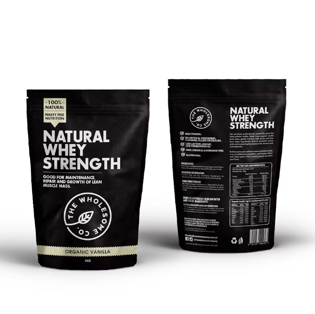
The most elegant and sophisticated color is black:
Black is sophisticated, elegant, versatile, and mostly used color in graphic designing and product packaging. You want brand and marketing; this is powerful, elegant, mysterious, luxury feel, and looks amazing with metallic shades. Boxes with white in minimum amount and major with black look amazing and elegant.
When should black be used in product packaging?
Dark black is powerful and luxurious and is used for contrast and as the main color of the box. It also works with shades, yielding a mysterious look and choice for all sorts of audiences.
Looking for convenient, professional, and formal color – Grey is for you:
This is light black, and we can say a middle point between white and black color. So, it is balanced, and we can use it with matching as well as contrast.
Gray is a responsible, mature, positive color but holds traditional values. It lacks emotions, serious, reserved, but feels safe for product packaging. This is a straightforward option for consumers, and looks elegant.
When should gray be used as a box packaging color?
Sometimes it looks conservative, but looks amazing in the smoky charcoal color. It is being used with hue shades, and it is a good replacement for the blue color. Using gray in logo and product packaging for gym supplements, training, courses, books and skin treatment gadgets is the right choice.
Wealth, prosperity, and success with Gold, silver, and bronze metallic shades:
Metallic colors communicate values, provoke emotions, and look luxurious. Such shades and colors are different from others; they are not just colors but shades. If we talk about yellow and gold, these two are totally different. Gold is shiner and glows much more than yellow.
When should metallic shades be used in product packaging?
These shades are rare and used for luxurious product packaging. For a long time, such shades have been used for their shine and resemblance to metals like gold. These are sophisticated, elegant, and communicative, and they are not a traditional shade.
In the End: Find the best color for your product. Packaging Now:
Now it’s a time to think, as per target audience and target region. Think and brainstorm your mind, and find the best color that communicates best for your products. This makes your product packaging more effective and communicable and leads to the best-fit design carton for the product.
Choosing the right color is essential, but understanding cultural understanding of color is also mandatory. We should understand the emotions and aesthetics behind every single color.
Once you finalized the color for product packaging, work with an experienced designer, and yield the best design. We make collaborative partnerships with each client and help you grow your business. For more effective designs find our website collection.
Source of images and information is Here.